Flyers are great marketing tools because they can easily be distributed in multiple locations in order to capture a wider audience.
For many people, a flyer is going to be their first point of contact with your business, so it’s vital to make a good impression. If you’re advertising services, it’s important to give the viewer a friendly face. When they do further research, even if that’s online or over the phone, they’ll keep that person’s face in mind.
What are the challenges in designing a flyer? How do we create flyers that look great?
Let’s dig into a strategy and a concept for your flyer.
Design a flyer that connects to your target audience
Whether you’re advertising a furniture sale or a restaurant, you need to remember that your flyer has to be striking enough to be picked up and looked at by your targeted audience. This is a fundamental part of how to design a professional and effective flyer. The information on it has to be clear and to the point to convince that person to check out your sales or business. Questions you should ask yourself before you design your flyer is:
What is the age of your target audience?
What message are you trying to tell?
Who is the person who will most urgently benefit from what you have to offer?
The biggest challenge when designing a flyer
With most flyers restricted to a standard A5 (148 mm x 210 mm) or A6 (105 mm x 148 mm) page size, you’re going to need to think a bit more creatively about how to layout your design whether it be landscape or portrait, single or double sided.
Consider visuals, colours and fonts for your layout
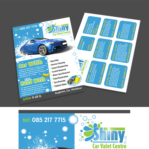
You can turn stunning photos into the main attraction when making a great flyer. One way is to try and place them behind other items of content, like shapes, colours and text.
Gradients and transparency effects are fantastic for allowing you to step outside the usual table grid layout and create an abstract effect in your flyer design.
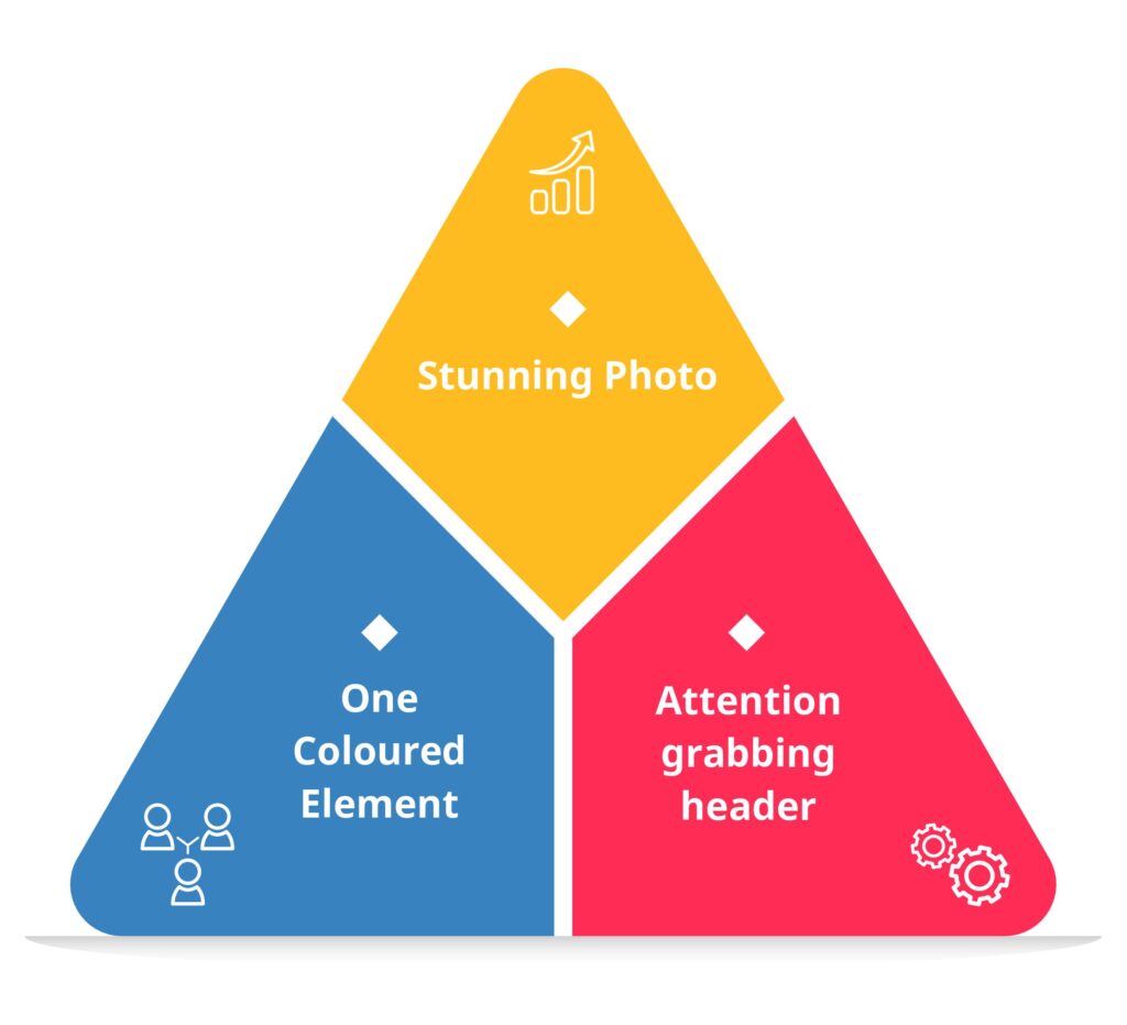
The three element rule
Create a balanced team of one stunning photo, one attention-grabbing header (in a bold slab typeface), and one coloured element.
This will avoid overcrowding and is pleasing to the eye.
Images should be clear and eye-catching, and remember that less is more – you don’t want to add too many visuals to your flyer, or it could be overwhelming.
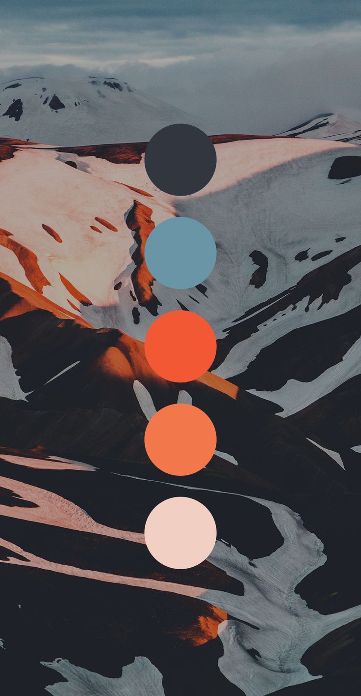
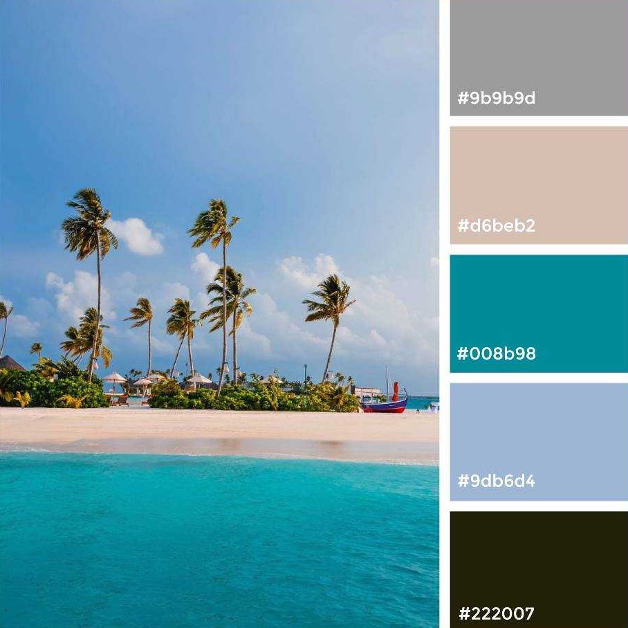
Choosing an effective colour palette for your flyer design
Colour, arguably more so than fonts or images, is the key player in defining the mood and personality of your flyer design.
Colour will play a significant part in enticing a reader to pick your flyer up. So you need to consider colour as playing a strong psychological role in your design.
Citrus tones, like oranges and yellows, can appear zingy and optimistic, which is great for more informal flyer designs.
Cooler tones like icy blues and pale greys can seem more intellectual and tech-forward, but can perfect for eye catching photos
If you’ve got more than one image and can’t decide which one to choose, try experimenting with shapes to create a modular style. This can add a lot of character and interest in your flyer design.
Most software programs will have a range of default shape tools, including circles, squares, and polygons, which you can use to create a unique design.
Now that you’ve thought about visuals, you need to start writing the content for your flyer. Make sure your content is concise and to the point. You should include any information that you think is important, such as prices, contact details, and so on.
Eye catching headline or title
Your title should be memorable, unusual, or provocative using a few carefully chosen powerful words such as: Easy, Unlock, Finally, The Secrets to, How to, Insider, Time-Sensitive, Free Bonuses, Discover, Now You Can, and Proven.
There’s a reason why it’s trendy to use scale and colour to bring emphasis to your title.
While keeping your content black/grey, for your powerful word you could add a red colour that really stands out on the page, this will command attention against the rest of the design elements.
Proofread the design and details
Check that everything is laid out correctly and that the visuals look good
Once you’ve written your content and designed your visuals, it’s time to proofread and edit your work. Ensure there are no spelling or grammar mistakes and that everything makes sense.
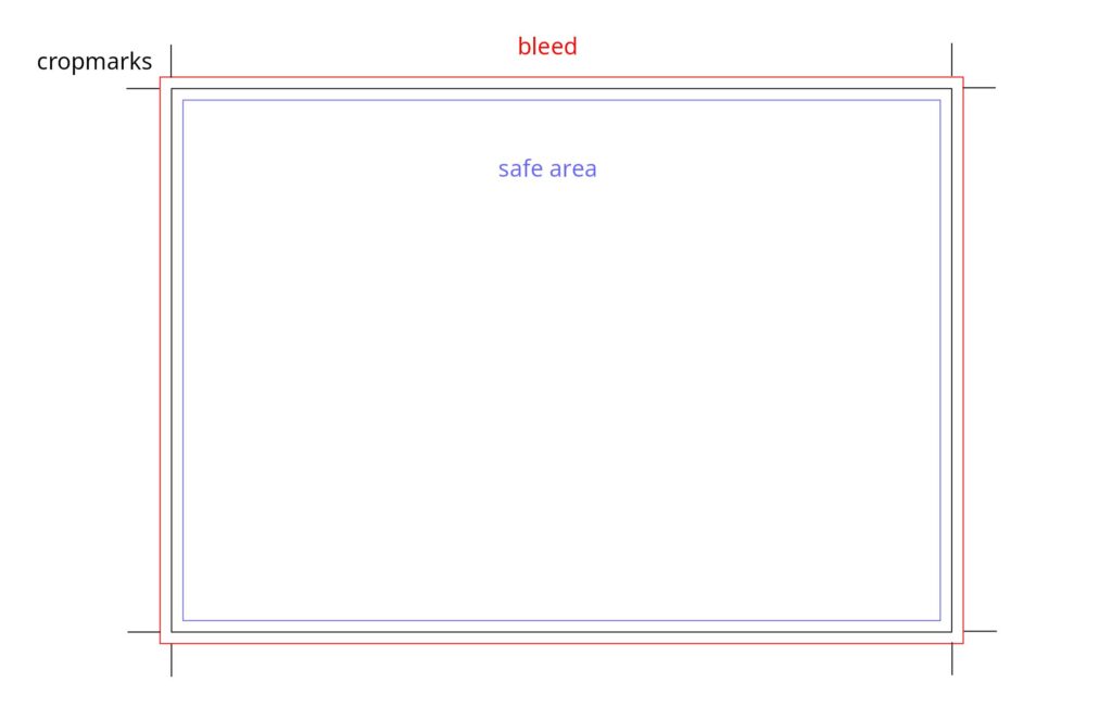
Check your design for bleed and crop marks
Bleed and crop marks are to ensure that your flyer is cut accurately and has no white edges. Bleed is the area that extends beyond the final size of your card, usually by 3 mm each side and crop marks are thin lines that indicate where the card should be trimmed.
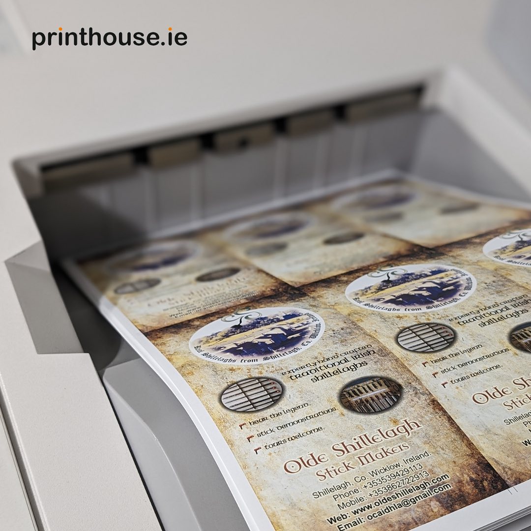
Check your colours and images for print quality
The colours and images on your flyer can look different on screen and on paper, depending on the colour mode, resolution. You should also use high resolution images, preferably 300 dpi or higher, and avoid using images from the web, which are usually low quality.
Set your quantity of flyers
Generally the higher the quantity the lower the price, remember to check out our prices at printhouse.ie or email info@printhouse.ie for a quotation.
A flyer you can trust
At Printhouse.ie, we help you make a great first impression with potential customers and business partners. Delivering high quality flyers to your doorstep, saving you the hassle of having to travel to pick them up. You’ll be amazed at our fast turnaround times. So, what are you waiting for? Get your flyers delivered throughout Ireland when you order online at Printhouse.ie.
Previous
How to choose the right business card for you
Next
The Ultimate Guide to Effective Van Signage: Turning Your Vehicle into a Mobile Billboard